small kitchen remodel
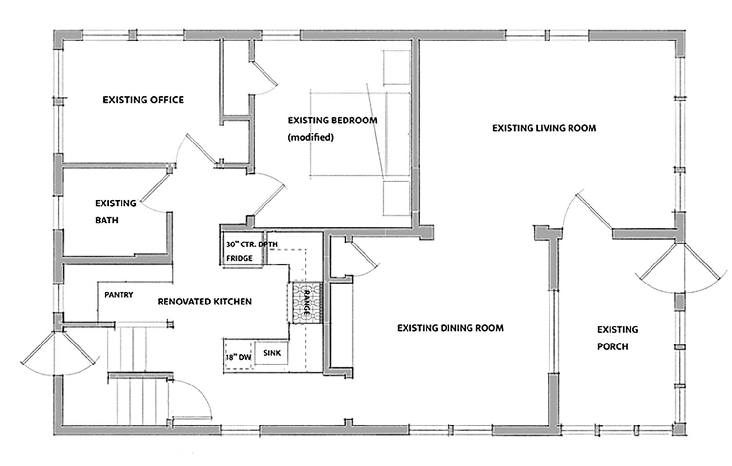
This case study shows the exploration of different layouts for a kitchen that is very limited on space. Built in the 1920s in an old city neighborhood, this little one-story cottage has a single full bath on the first floor and two small “bedrooms”, one is used as an office the other a TV /guest room with a pull-out couch. The dining and living room at the front of the house has original oak built-ins and columns, all woodwork and plaster are original, it’s a cozy, warm space. The attic is finished as one big room and is used as the primary bedroom, the basement is unfinished mechanical and utility space. This small awkwardly shaped kitchen is where this all starts, as it’s the circulation hub for all these spaces described above, with many paths cutting through the workspace.
The clients wanted to examine as many different design possibilities for making this tiny kitchen in this tiny house a more functional space for the two of them. We presented four different schematic design solutions, starting with minimal modification to the existing built space, to multi-room remodel solutions, improving of those spaces in the larger context of the first floor.
FIRST FLOOR PLAN - EXISTING
ISSUES:
the kitchen is a circulation hub with all activity moving through it in one way or another.
the built space for the kitchen is small and irregular.
lack of counter workspace
no dishwasher
bathroom, office and bedroom are all very small and cramped spaces.
SOLUTION #1
HIGHLIGHTS:
Kitchen: the shared door between the bedroom and kitchen is closed off, consolidating the movement through the house. This allows for an efficient U-shaped arrangement in the kitchen, increasing the workspace and adding a much desired dishwasher.
Pantry nook with floor-to-ceiling storage.
Bedroom: the door into this room is relocated, making more space for bed placement.
The modifications in this plan are minor, working mostly with the existing walls.
SOLUTION #2
HIGHLIGHTS:
The kitchen is flipped to the outside wall, taking some space from the bathroom.
Circulation through the kitchen has been separated from the workspace.
Kitchen: small but efficient, with a lot of counter space ending in a small eating peninsula, along with a full-sized dishwasher.
the long galley-like workspace feels spacious with the openness of the modified circulation paths.
The office and bedroom are remodeled into a more spacious full bath and bedroom/office.
The new bathroom is more centrally located.
SOLUTION #3
HIGHLIGHTS:
The rear stair coming up to the first floor from the outside is rotated 90 degrees along the outside wall, windows are added for more natural light, built-in coat and boot storage.
By moving the rear stair, circulation is consolidated to one path, even though it’s still through the kitchen it is much more efficient.
The kitchen space is a bit larger and proportioned for adequate work areas and appliances.
The existing bathroom and office are moved and modified.
The bedroom: door location moved and reduced to one door, the closet is relocated in the room.
SOLUTION #4
HIGHLIGHTS:
The door opening from the dining room to the kitchen is flipped to the other side of the room.
The kitchen expands on the outside wall, taking over the space of the bathroom and office.
New kitchen includes an eating island and a lounging area with room for a big screen TV.
The bedroom remains as is.
The stair circulation from the basement to the second floor is isolated from the kitchen, with a slight modification. Visually opening up the stairs by removing the door/wall and extending a wide bottom landing taking advantage of the existing window for natural light.
The new bathroom is more centrally located.


