first floor remodel
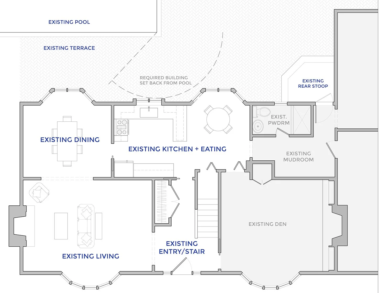
This case study presents the design exploration carried out during the schematic design phase of a first-floor remodel project that aimed to update the kitchen opening it to the dining and living. The following presentation showcases different layouts for reconfiguring the first-floor "public" spaces, which are currently dark and separated due to the formal layout of this two-story 1960s colonial house. The entryway is unwelcoming, and the kitchen and eating area feel cramped due to the current placement of cabinetry, furniture, and appliances. Although the dining room and kitchen offer a beautiful view of the private wooded backyard, pool, and terrace, there is no direct access to these areas, and the only way to access them is through the mudroom. The current kitchen and eating area are outdated and do not meet the client's functional requirements.
GOAL: The clients want to open up and maximize the use of these spaces for everyday life with two middle school kids and for occasionally entertaining.
FIRST FLOOR PLAN - BEFORE
ISSUES:
The kitchen and eating area are separated by an island that has overhead cabinets, limiting the use of the island and making the space feel cramped and closed in.
There is no access from the kitchen to the backyard terrace.
The eating area is tight for a table and family of four.
The entry hall while it occupies a lot of area, it feels small and uninviting.
The “public” rooms are very separate and dark, the flow is stagnant, not an ideal set up for a client that likes to entertain.
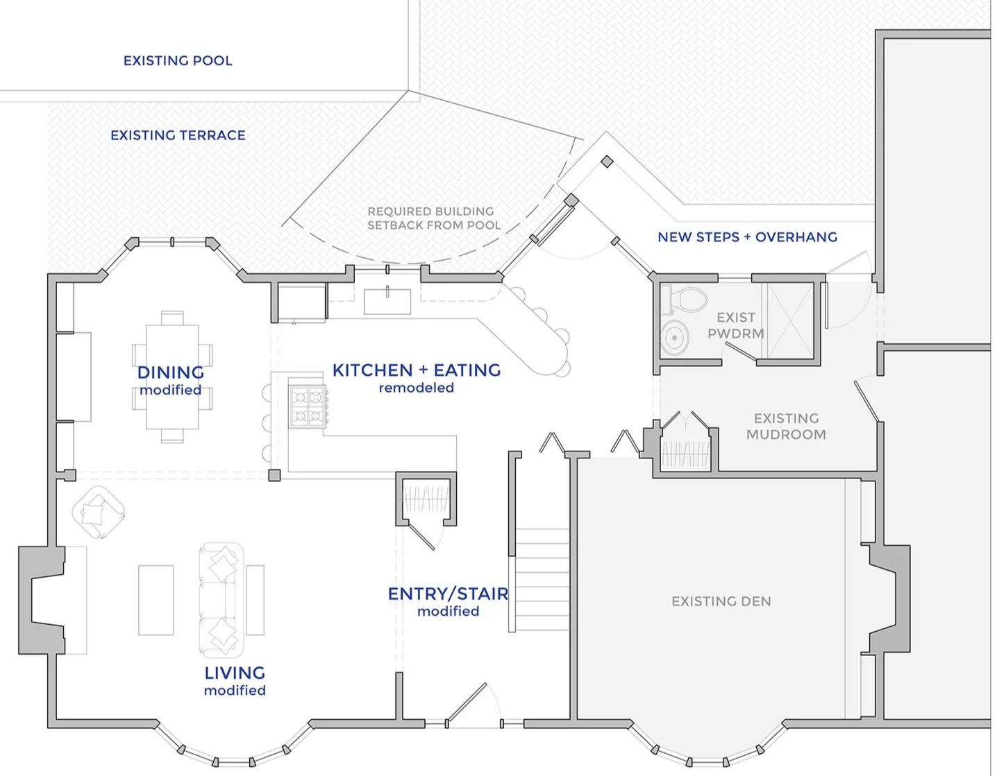
SOLUTION #1
HIGHLIGHTS:
kitchen bay window is modified to create more space for an exterior door.
The eating area is integrated with the counters, serving a dual purpose by providing more workspace.
kitchen is open to both the dining and the living.
multiple areas for eating.
built-in storage in the dining room.
The closet was reoriented and reduced in size to center the entryway, emphasizing guest arrival.
SOLUTION #2
HIGHLIGHTS:
kitchen bay window is modified to create more space for an exterior door, which connects to a new screen porch.
kitchen is open to both the dining and the living.
the access to the kitchen through the entry is closed off.
sit down eating is all in the dining room area, at the island or the table.
added built-in storage in the dining room.
Access to the kitchen is removed while the entry to the living room is widened and centered to create a better arrival experience for guests. The closet is reoriented to optimize space.
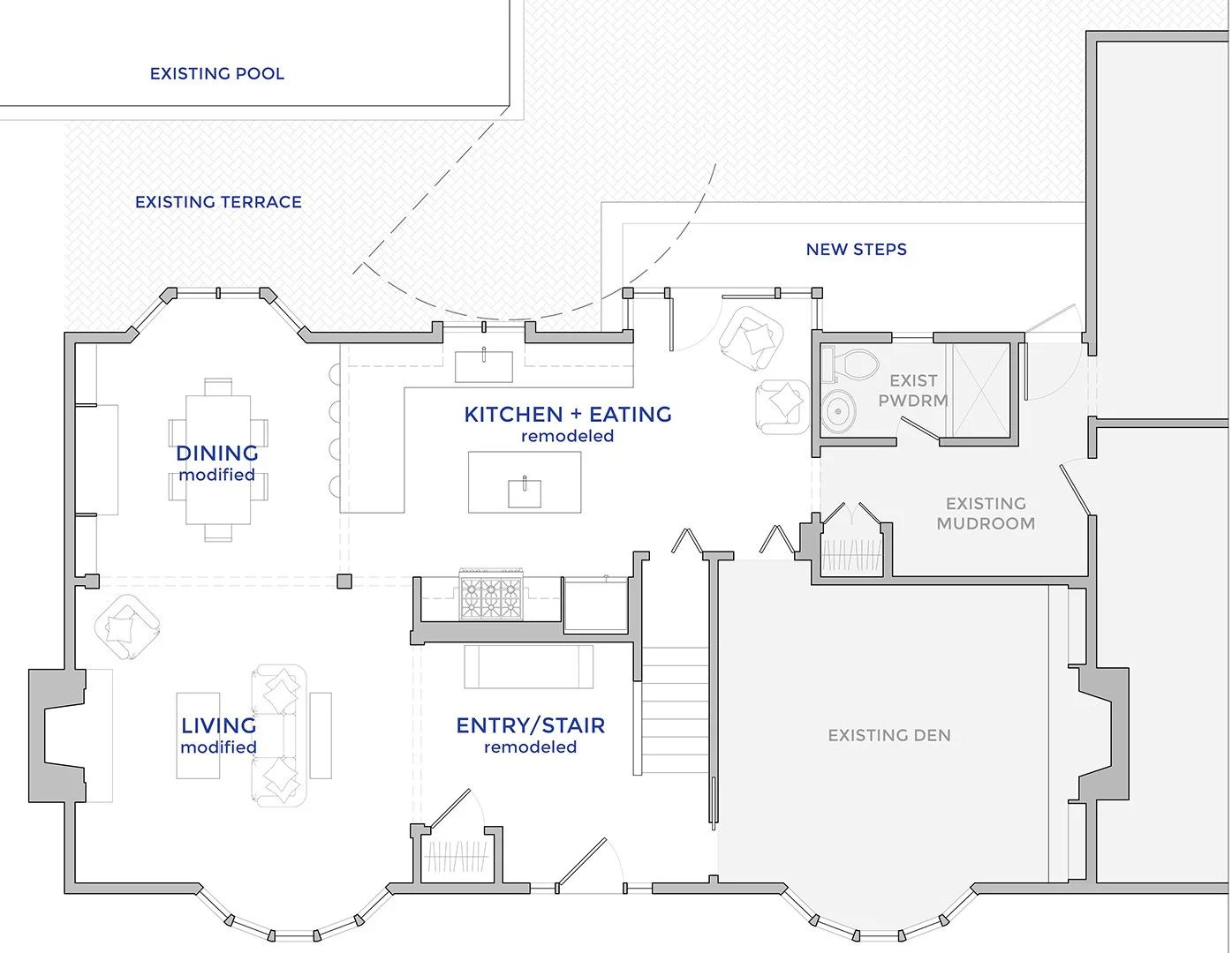
SOLUTION #3
HIGHLIGHTS:
kitchen bay window is modified to create more space for an exterior door.
kitchen is enlarged, taking over some space from the living room and entry and eliminating the access to the kitchen from the entry.
the extra kitchen space allows for a prep island.
sit down eating is all in the dining room area, at the island or the table.
added built-in storage in the dining room.
The entrance has been modified by adjusting the shape of the area. As a result, the living room has slightly less space, while the kitchen has gained a bit more. The closet has been moved to a new location. The entrance to the living room has been widened and centered to make it more prominent and welcoming for guests.


